2015.
Aquatint.
Edition of 4.
103 x 54cm
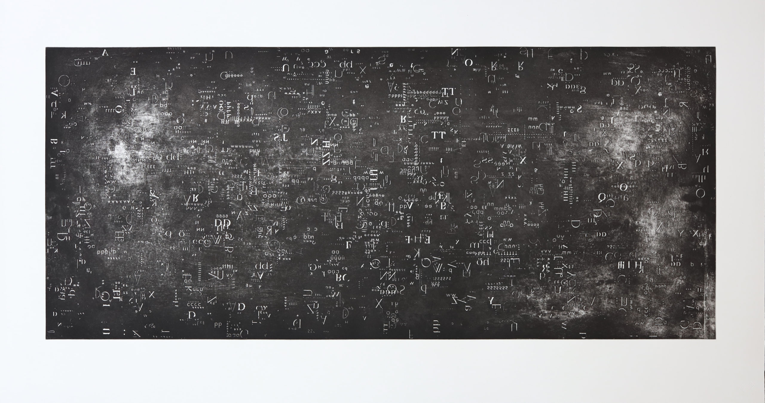
The largescale print was created using a single layer of aquatint and Letraset. The plate was first layered with Letraset of multiple sizes to create a random arrangement. (Letraset is a dry transfer material that was developed in 1959 used by a wide range of industries such as graphic designers and architects. The type transfer is now long in demand as it use to be with the use of computer and is not as widely produced). In which there are letters that overlap, letters that cluster together and ones separated in order to create open spaces. The work was created during de Beer’s BAFA final exhibition in 2015. This print work like many on the exhibition was a representation of her dyslexic experience. The main concept that de Beer explored was that through her dyslexic experience words often carried no coded meaning, but rather that they existed as abstract visual forms. In this work, she explores this concept whereby the lettering in the print only acts as visual forms rather than carriers of meaning. Even though they exist in this way, it does not stop viewers from recognizing the letter to be a form of written language. The viewer will try to make sense of the letter, but because of the layering and movement created in the print, this task becomes impossible. Resulting in the viewer viewing the letters as purely visual forms. This strongly echoes de Beer’s dyslexic experience when trying to decode written language.
.